COVIDCompare
COVIDCompare
.png)
COVIDCompare

Our Challenge
Governmental responses to COVID-19 have been largely reactionary and slow. Instead, more proactive measures should be undertaken to mitigate its spread and damage. However, there is currently no open source platform that enables researchers to find causal links between environmental factors and COVID-19 cases.
Our Solution
We propose a heatmap based platform that enables users to visualise and map correlations between any environmental data source and COVID-19 case data, paving the way for predictive modelling of potential virus clusters in the future. This platform is targeted to aid public health researchers and policymakers by giving them greater ability to find causal link to the spread of COVID-19.
How it works

Upload Data Source
Anyone can upload an environmental data .TIFF file to our platform to generate a heatmap. Examples of environmental data include: NO2 emissions, temperature, precipitation or cloud index
Auto generation of heatmaps
COVIDCompare automatically converts the supplied TIFF file into a heatmap overlaid on a map. By adding this overlay on the COVID-19 heatmap, the correlation between the two factors can be clearly visualised.


Visualisation of correlation
By adding this overlay on the COVID-19 heatmap, the correlation between the two factors can be clearly visualised. Over time, with enough data sources, a reliable causal link could be found between environmental data and COVID-19 cases.
Examples
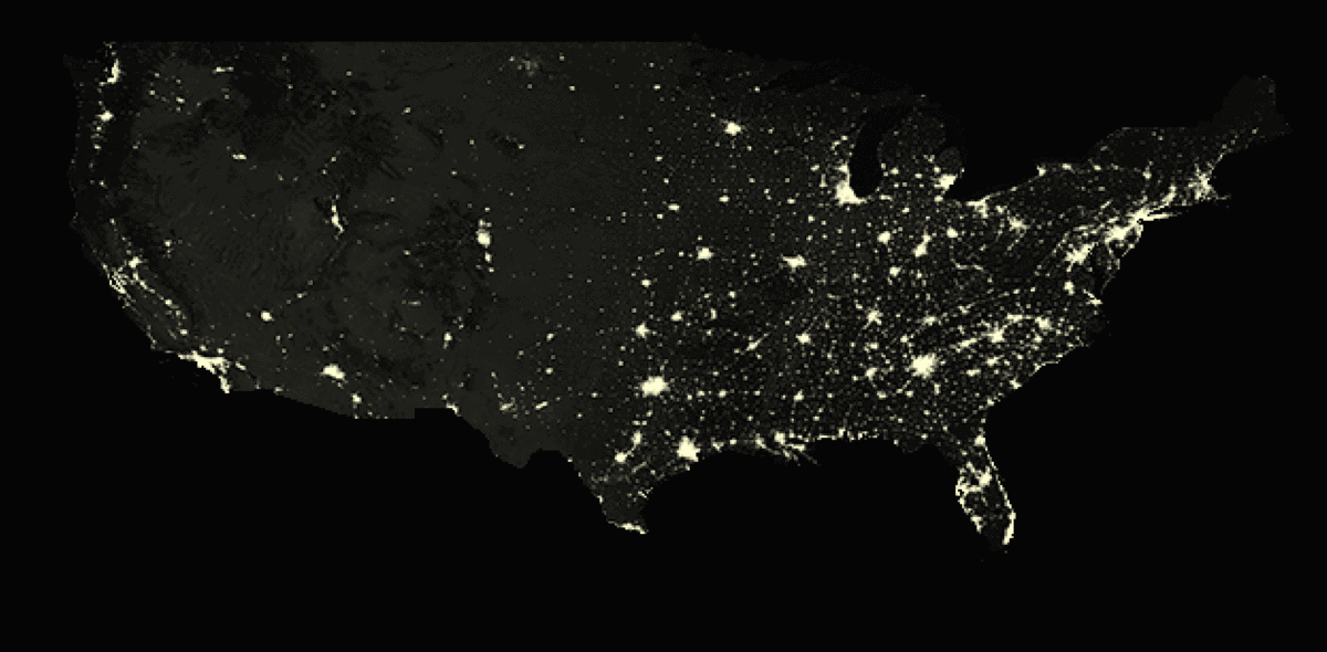
Nightlight (NASA Earth Observatory)
By adding this overlay on the COVID-19 heatmap, our platform shows the strong correlation between the two datasets in a simple and intuitive format. A correlation index will also be provided, allowing researchers to quantify the correlation between two datasets on a scale of 0 to 1.
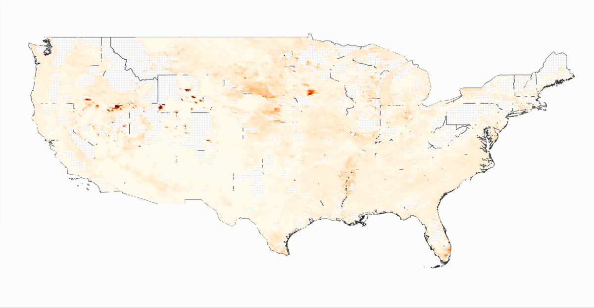
Aerosol Particle Radius Data
(NASA Earth Observations)
People in areas with high concentrations of aerosol particles in the air stand a higher risk of lung problems. With this heatmap overlay, we are able to predict potential clusters of COVID-19 in the future, giving healthcare professionals and policymakers more time to react and mitigate spread.
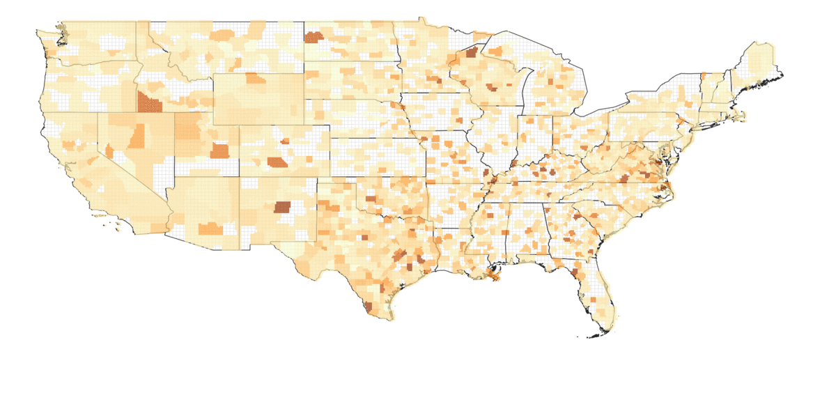
Primary Care Providers to Population Ratio (County Health Rankings)
Areas with a low number of primary care providers (doctors, nurses etc) compared to its population stand a higher risk of being overwhelmed if COVID-19 cases grow exponentially. With the COVID-19 heatmap overlay, it is clear to see which areas are more prone to the virus and that require more medical support. In this example, it shows that our platform paves the way for future development in neural networks to predict potential COVID-19 clusters.